Dates: Nov, 2018
My roles: Research; sketching; prototyping making
Skills and tools: Wireframe creating; prototyping & testing; Adobe XD.
Group project with: Thu Nguyen, Xinyue Du, Senciria Chou, Juuso Koski
The cafeteria A Bloc in Väre had just been opened for a few months. There were complaints that compared to the other cafeterias, it took longer for students to get their food. We did a project and found that the new payment system used by the cafeteria might be one of the factors.
The goal
The project aims at improving the payment experience in Väre’s A Bloc cafeteria of Aalto through redesigning the payment system.
User Research
We did a rapid-ethnography and observation during during rush hours and off peak, conducted semi-structure interviews with students and context inquiry with the staffs.
The payment machine: The engineering style interface with non-hierarchy information display make it hard for users to figure out how it works.
With this payment machine, students are supposed to choose what they want to have by themself. However, their student status have to be verified by a staff before the students to pay. Only after payment can students go to take their meal.
With the findings, we mapped the behavioral variables of interviewees to have a clear understanding of personas behaviors, goals and types.
The Hierarchy Task Analysis
Concept Development
Based on the persona goals and the HTA, we defined our design tasks to be:
- Optimize the user flow
- Make the user interface self-explanatory
- Value human cognition and conventions
Paper Prototype
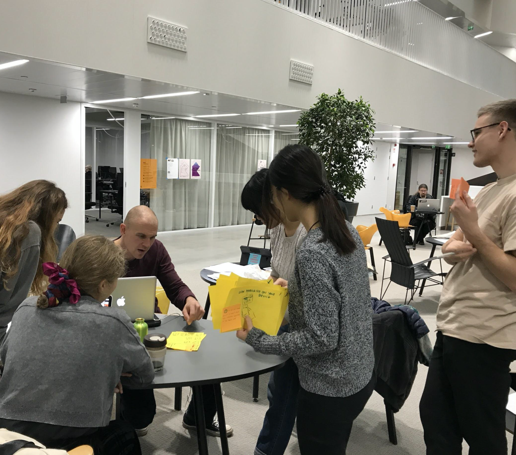
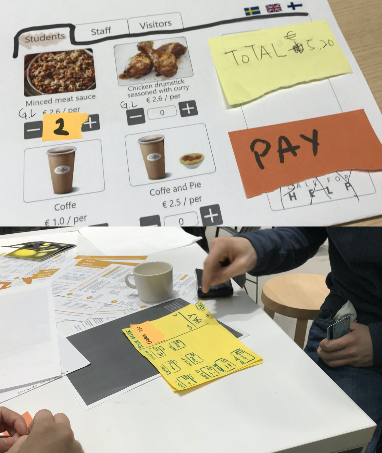
With the concepts we created, we made quick paper prototype to test with students in the lobby and comparing pros and cons of different concepts. In this way, it is fast to make and change the prototype. The feedback we collected could focused on the interaction process.
The Improved HTA
Visual design
Sticked to the Fazer visual language, we change the system into Fazer blue with a clean and simple style. In addition, the human cognition of making an ordering was taken into consideration through visually optimizations: attention with colors and the appearing button.
The Outcome
Student-pay with credit card
Student- pay with mobile pay
